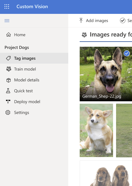
As the lead designer, drove the vision and UX strategy for Azure AI Custom Vision—transforming the v1 product through heuristic evaluation, workflow redesign, and Fluent Web integration to deliver an intuitive, modern experience for building, training, and deploying image recognition models.
Situation
Azure AI Custom Vision v1 was a web-based image recognition service enabling developers to build, train, and deploy custom image classifiers.
The Version 1 product experience was difficult for users to understand — workflows were unclear, navigation was unintuitive, and the design system felt outdated.

Task
Conduct a heuristic evaluation of the v1 experience to identify usability issues.
Redesign the workflow to make the process easier to follow and more modern.
Align the product with Fluent Web v1 design language for consistency across Microsoft services.
Validate improvements through usability testing and competitive analysis.
GOAL 1
Reduce user confusion by making the five key steps (upload, train, review, test, deploy) visually explicit and easy to follow.
GOAL 2
Shorten onboarding and task completion time by adopting Fluent Web v1 design language and updating UX components for consistency and accessibility.
GOAL 3
Improve usability scores and positive feedback in testing by ensuring participants can navigate, understand, and complete model creation tasks without barriers.
ROLE
Lead UX Designer
TOOLS
Figma, sketches
TEAM
3 engineers,
2 Program Managers,
1 UX researcher
TIMELINE
9 months – 2021
Action 1 – Heuristic evaluation of Custom Vision V1 and survey of existing Microsoft portal UX patterns to borrow proven navigation structures


Survey of existing portals
I did a survey of existing Microsoft portal UX patterns I could borrow from. Why not align to what other products are already doing? They all use a left nav pane of some kind. Be part of the Microsoft family!


Action 2 – I documented the primary task flow and made sure the team was in agreement


Action 3 – I proposed a left‑hand navigation pane to represent the primary task flow (upload, train, review, test, deploy)
Could we use the left nav to vertically represent the primary task flow that a Custom Vision user goes through?
1) Upload and tag images, 2) Train your model, 3) See the details and quality of the model, 4) Test the model and 5) Deploy the model.

Action 4 – I created Figma prototypes and we ran usability tests with targeted questions about navigation, task completion, and comprehension
How well can you navigate the v2 design?
Are you able to identify and complete the tasks required to create computer vision models?
What barriers and pain points do you face in using the v2 design and Custom Vision workflow?
How well can you understand the value proposition & potential uses of Custom Vision from the marketing page?
Video of Figma prototype used in test
Study results

Result – I synthesized user feedback and competitive analysis findings into the final design
The v2 design was well-received and intuitive for participants. They easily grasped the steps required to create, train, and deploy a model. The clean layout and left-hand flow made navigation straightforward, contributing to a smooth user experience. Overall, participants expressed satisfaction with the process and indicated they would be happy to use Custom Vision in future projects.
Final designs with Fluent Web components to modernize the interface and ensure consistency.


